Imago Dei Pride

The goal with this project was to create a simple, clear design that affirms the worth of LGBTQ people. The “Imago Dei” is a Christian theological concept that grounds the worth of individual people in our reflection of the image of God. For LGBTQ people, to link our queerness to the image of God in us is to proclaim that who we are is a beautiful expression of God’s nature. Something to be celebrated and cherished.
Art Direction & Design: Salem Pierce

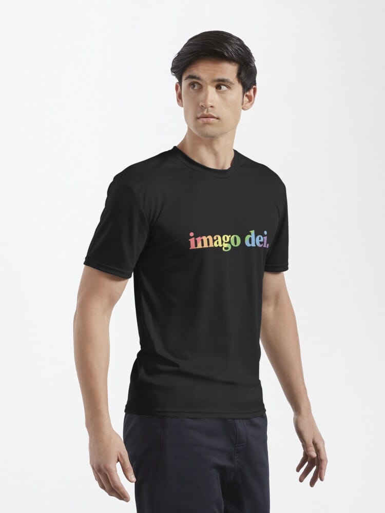
Product images courtesy of RedBubble.
Process
Apple’s rainbow logo from the 1970s was a major influence for this design. The initial design used the Cooper Hewitt typeface for a retro-modern feel.
I adjusted the well-known rainbow palette for optimal contrast with a black background, resulting in a set of pastel colors. But the horizontal stripes — especially the green and blue — bled together too much, so I began to play with different patterns to make the rainbow read better.

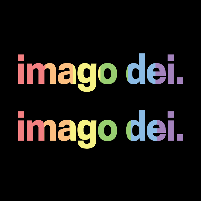
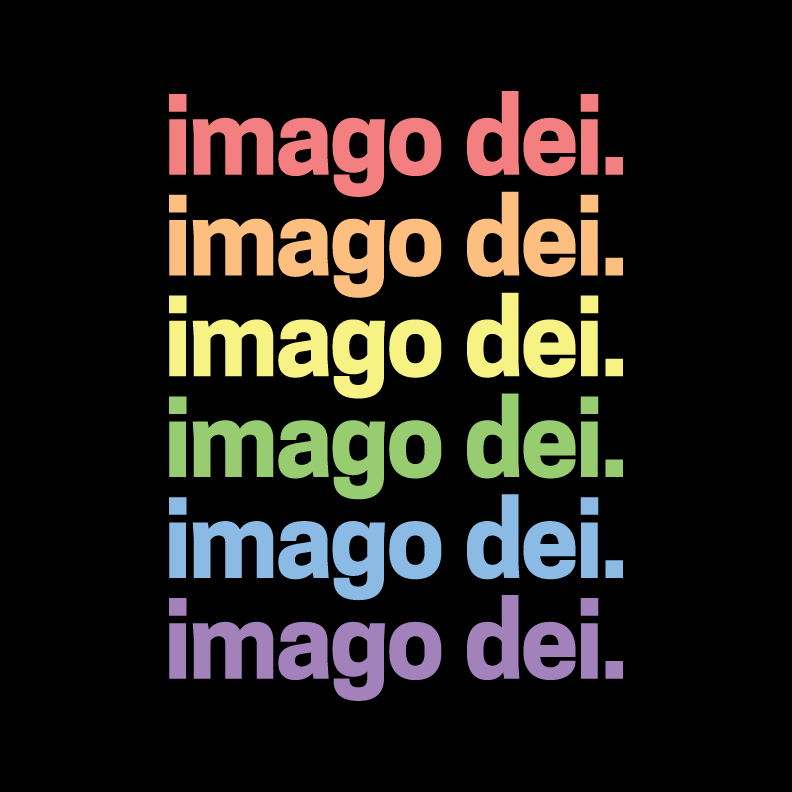



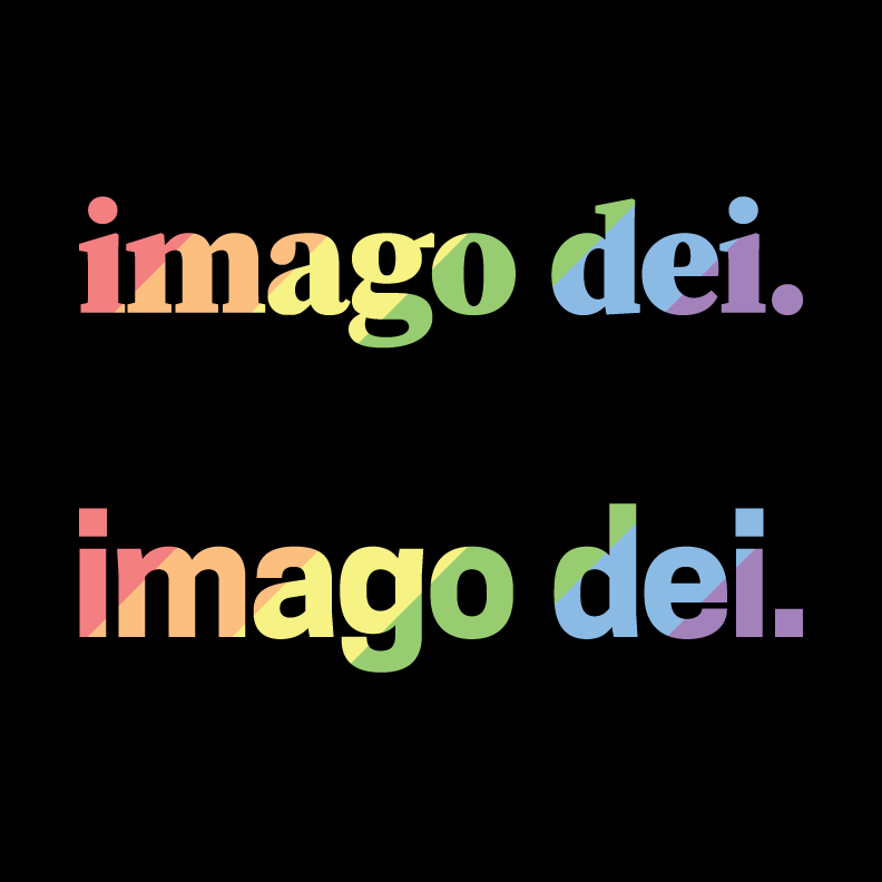

Iterative design process.
As I worked through the different iterations, I settled on the diagonal stripes suggested during a feedback session with a fellow designer. However, the font did not mesh well with the new pattern. After trying a few different options, I settled on Source Serif Pro Black.
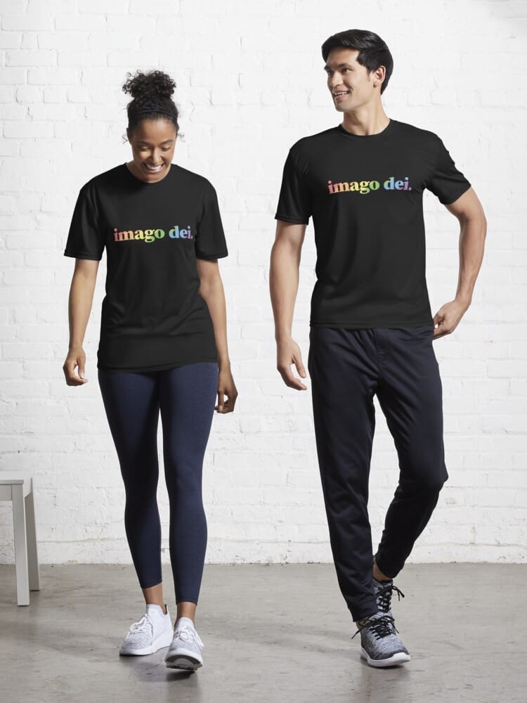

Additional product images courtesy of RedBubble.
Further Development
The initial design was popular and sold well. This lead to requests for variants featuring the pride flags of specific communities under the LGBTQ+ umbrella.
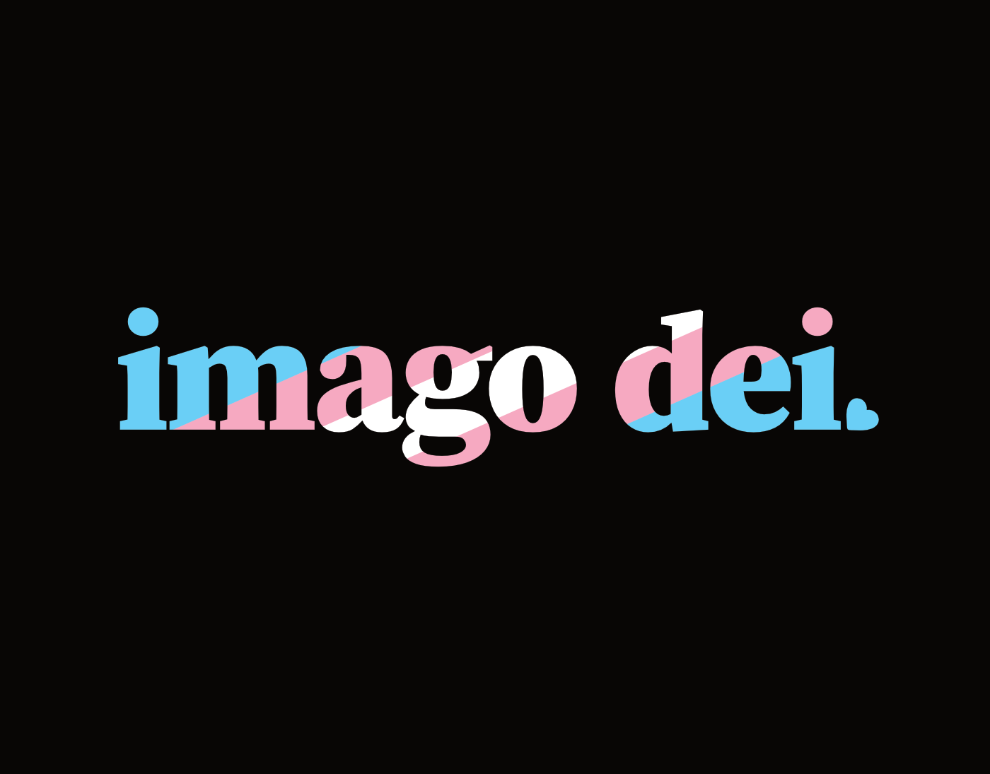



Variant designs based on other pride flags.
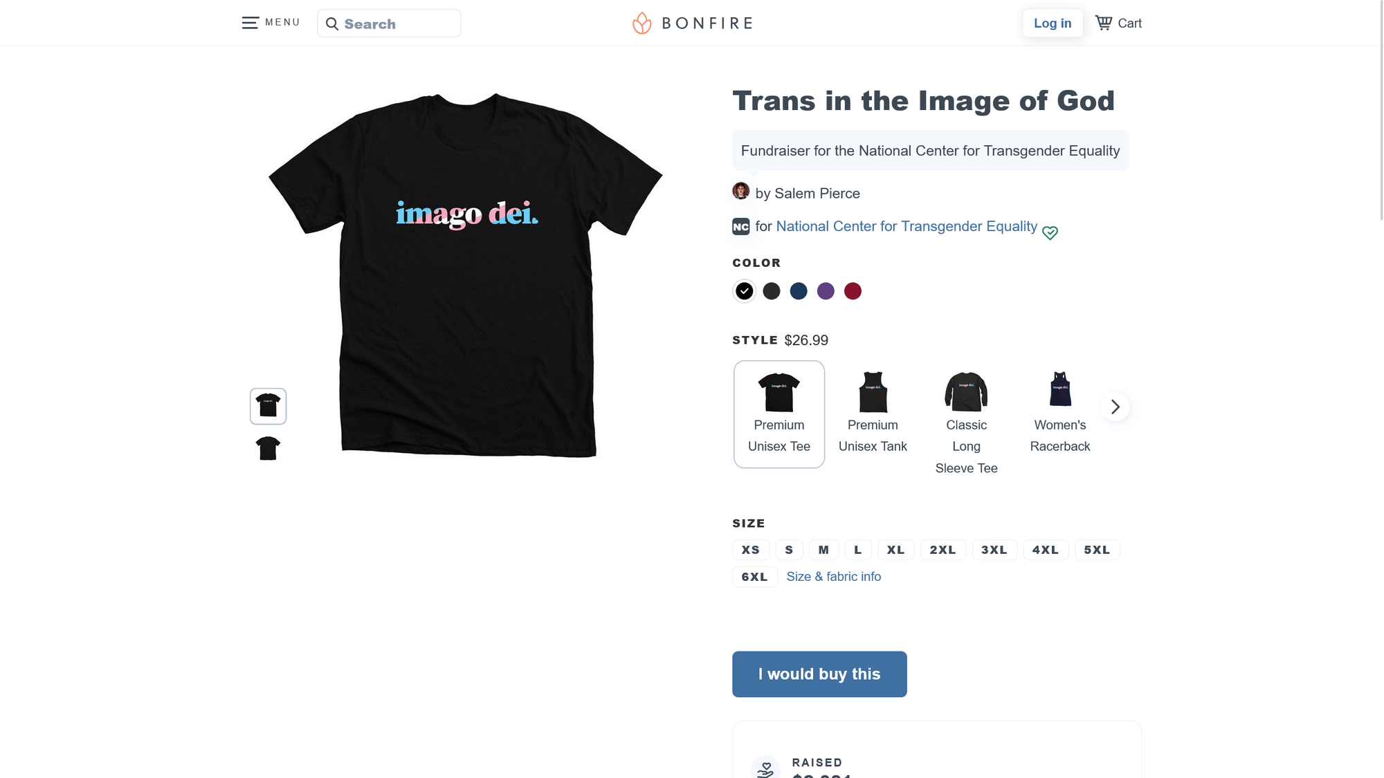
Trans in the Image of God Fundraiser
Building on the success of my original design, I started a fundraiser using the tran pride variation of the design to support the National Center for Transgender Equality. To date, sales of this design have raised nearly $3000 for trans rights in the US.